Website Design Standards in 2023
That’s where ‘User Experience’ design comes in. When you work with a designer that models the site layout based on your future visitors, you’re more likely to have a site that easily guides customers into buyers.
How do designers know what works and what doesn’t? Most follow the “Standard Web Conventions” practices, which are essentially a set of rules that dictate good techniques and bad design ideas. They are applied in conjunction with visitors’ expectations and act as guidelines for precision and usability.
Alongside these critical rules, it’s also important that web designers keep up with the times. There is nothing worse than an outdated website. Websites looked a lot different ten years ago, so it’s always essential for a designer to keep an eye on digital trends, check out what competitors are doing, and update website to reflect these changes.
If you want your website to stand out, you’re going to have to team up with a professional designer and learn what today’s trends are.
So, what makes an on-trend website in 2023?
80% of websites use the same design approach, labeling them ‘standard websites.’ That’s because designers know this approach works.
When you visit a website using the standard design approach, you will notice that nearly all of them conform to the same layout. Ignore the various color schemes and branding; notice that your mouse seems always to be directed to icons or tabs. Expect text in the center of the homepage, with a sidebar of tabs on the top or left-hand corner.
There’s nothing wrong with this approach; it’s reliable, the industry-standard, and not what we think you should change. In 2022, it’s the design details that make the difference, not radically changing your website’s appearance.
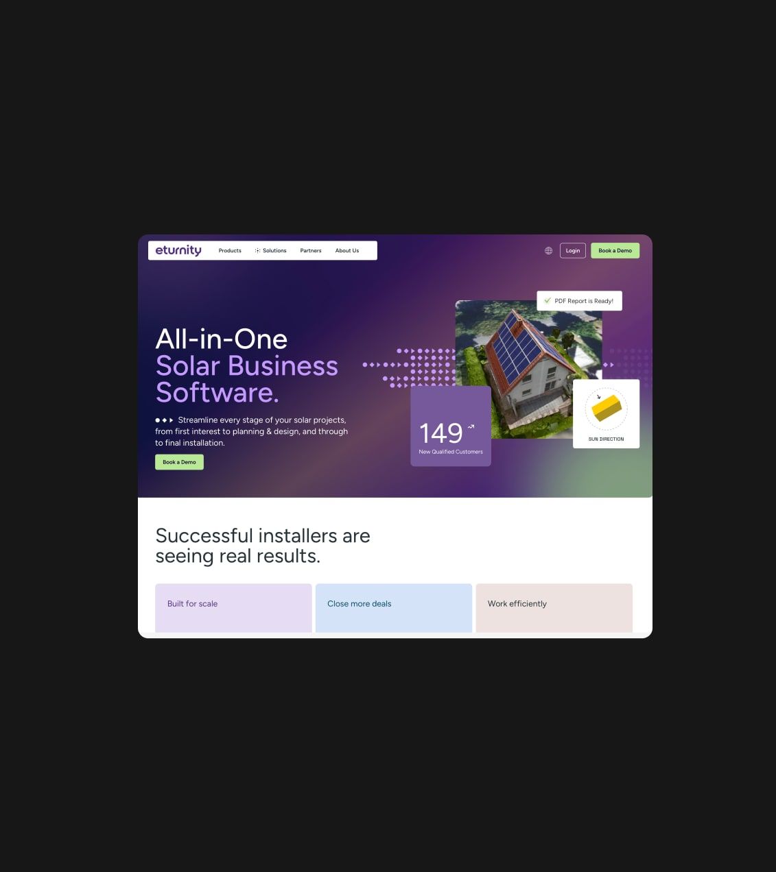
With a strong foundation to rely on when it comes to designing a layout, designers in 2023 are coming up with some variations to make the design process more exciting. Help your business stand out with these trends in 2023.
Minimalism

You can never go wrong with minimalism. Always on brand and always a treat for the eyes, 2021 has seen a resurgence in minimalistic designs.
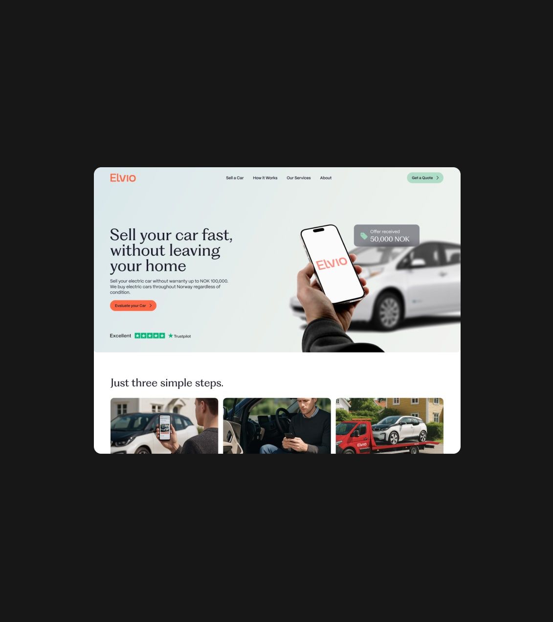
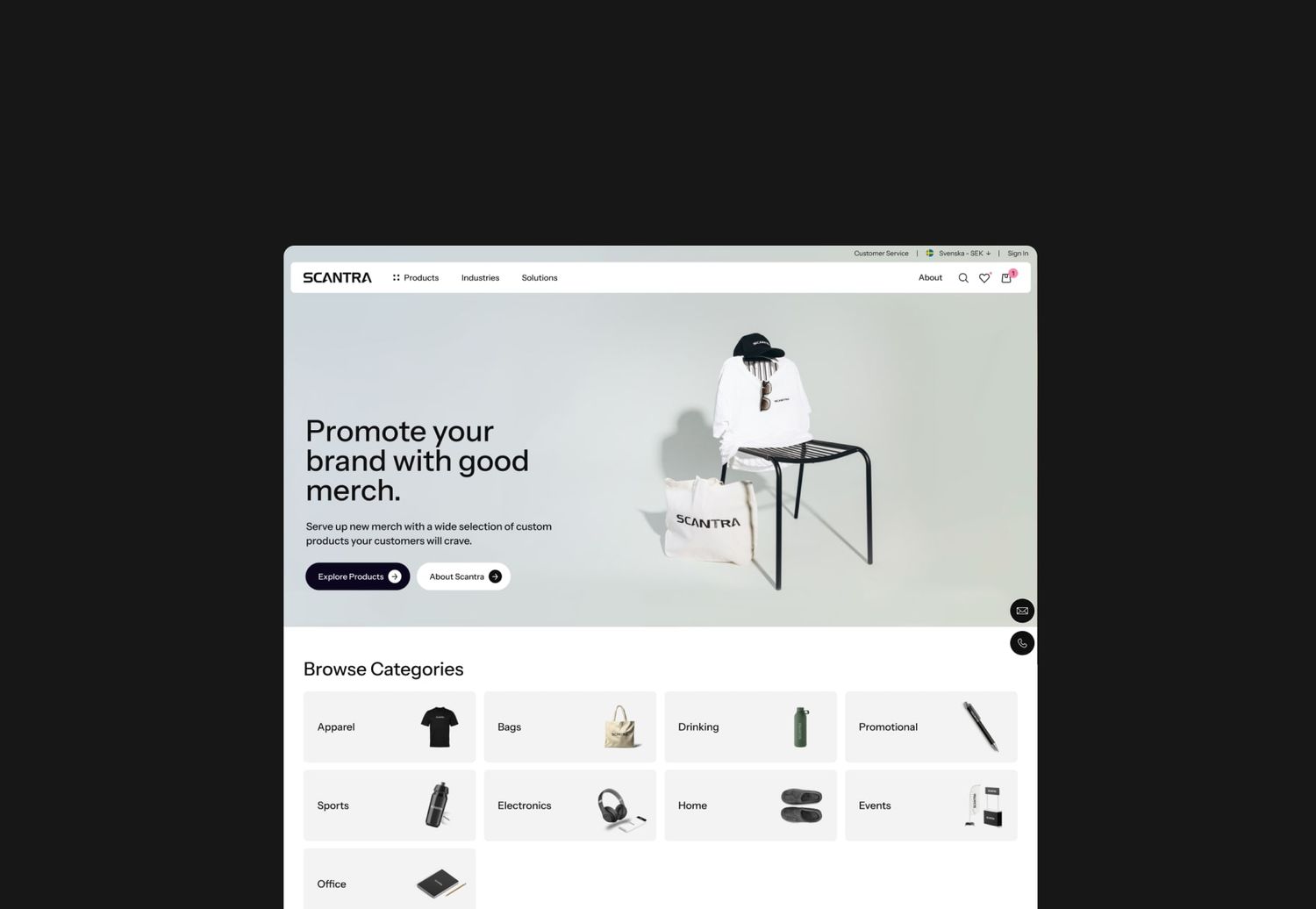
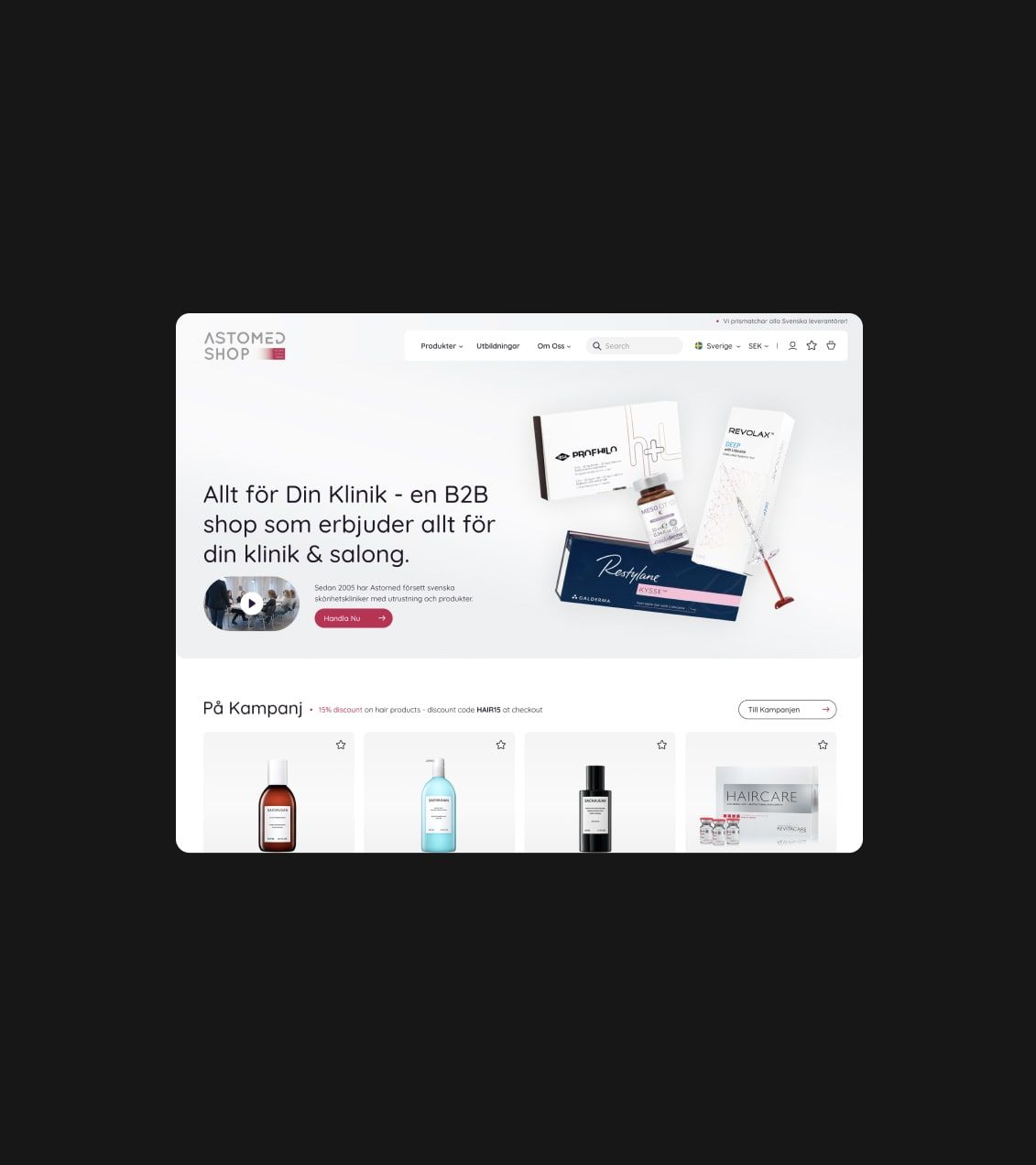
Going for the minimalism look in 2023 is a big yes. Minimalistic web design is always elegant and easy to understand, which is why they’re so useful. Use big white spaces with centered text and a gallery of only your best images. It encourages you to only put your best work on view for clients, not your entire portfolio.
Dark Mode

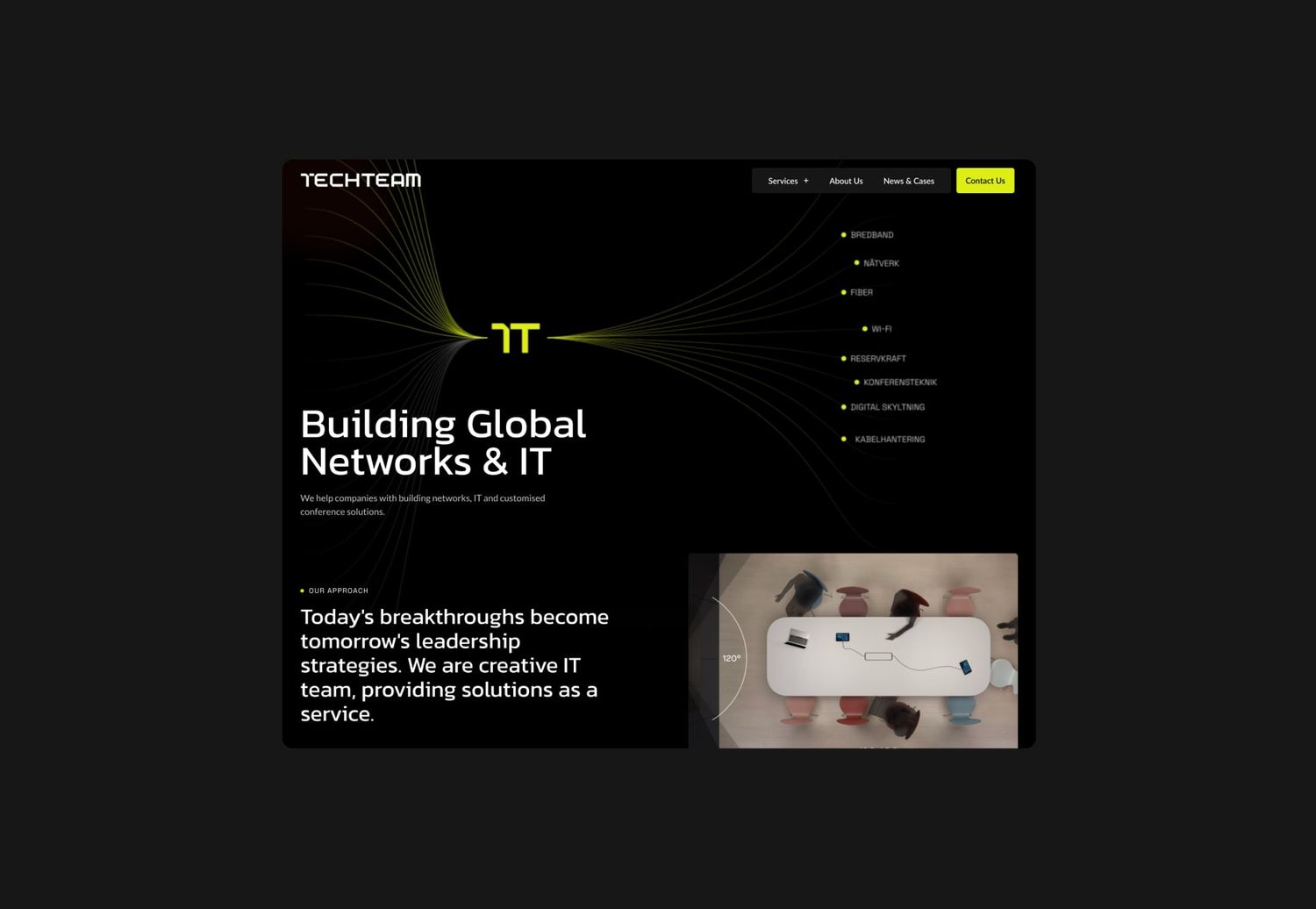
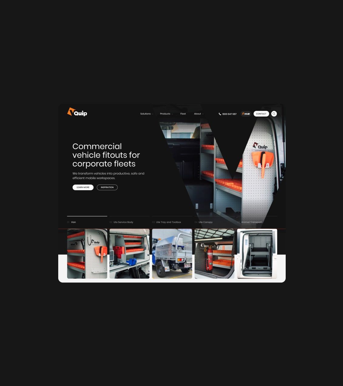
In contrast to the minimalism look that 2023 loves so dearly, the dark mode aesthetic is also a new craze for current web designers. Taking inspiration from ‘dark mode’ apps, designers are using dark backgrounds and dark images contrasted with bright, bold, and often large typography, presenting highly readable content.
Experimental typography

Some would say it’s something of a rebellion from the traditional standards of typography. 2023 has seen web designers create experimental typography and use experimental placing as opposed to conventional fonts. This works well with a minimalist interface- rather than overwhelming your visitors with chaotic information, you strip away the background and make your typography stand out.
Yes, it should still be readable and display the information it needs to, but typographers seem to be making more adventurous choices these days, and we are living for it! 2022 has seen odd spacing, sizing, unconventional line spaces, and even breaks. It stimulates intrigue when visitors see web typography in a non-traditional form.
This is a 2022 web design that we would like to see stay. Creativity is key, and simple changes in typography can completely change the way customers think about your brand.
Illustrations

Because illustrations are such a popular way of expression, especially on Instagram, it would be silly for web designers to not jump on the craze.
There are so many amazingly talented illustrators looking for an outlet. With cool, on-trend social media apps like Instagram providing a platform for artists, it’s so easy to find the designer for you.
2023 loves a line style illustration – they provide authenticity and look pristine.
3D Imagery

3D imagery on websites has become very popular in 2022. A craze that began at the end of 2022, 2023 has picked up and run away with the 3D ideas.
Realism designs use 3D imagery to create more depth to the images. Businesses are boasting full-scale 3D graphics on their site of construction blueprints, photography work, etc.
The best 3D designs on websites always add something a little unexpected. It might be a 3D image of a product on a clothing website that you can rotate and view from a 3D angle, or a 3D image of a company’s logo on the homepage. There are no rules other than that your design should always demonstrate what your brand offers.
Using headless CMS for development
Yes, using a headless CMS to develop your new website has become a growing trend in 2023, becasue of the rise of new technologies, frameworks and microservices, developers are increasingly turning to develop headless solutions as a way to build more flexible, scalable, and customizable websites and applications. It offer greater flexibility in terms of the development stack, where developers can use any front-end technology they prefer, such as React, Angular or Svelte, and integrate it with the CMS using APIs. This allows for more customized development workflows and modern design solutions, which is increasingly important as websites and applications become more complex.
Should we follow trend?
When you are redesigning your site, these tips will help you in your quest to create a successful website. Not every strategy will work for your business; you may never land on quirky typography that speaks to your company and have no use for 3D graphics.
Go with your gut – try a few strategies that seem like they would bring intrigue to your site so that your previous customers will delight at the changes, and new visitors will be intrigued by your brand.
Article Updated: 29 March 2023

