Examples of mental models in Web design
 Alex, founder & Designer at Roud
From our years of practice at Roud studio – one of the key factors that can be good for the user experience is use of mental models. While working on new projects for your client, you should think about how people understand and interact with the digital product. Those practices help users to understand how website works and how to navigate it effectively without learning new things.
As a designer, when I work on new projects, I can apply mental models that are similar to the past experiences users had in similar fields. It will help them to navigate websites without spending too much time and by doing so, I am designing websites that align with these basic rules and make user experience better.
Most common elements that illustrate use of mental models in web design.
If all websites and interfaces are using the same design, it would result in a boring and uninteresting experience, but what if all websites use completely different designs and interfaces in all aspects? Exactly – it will be impossible to navigate, because users will have to learn something new and can’t apply their experience from the past. They may leave the web page right away.
Much of this similarity is based on design trends, there are good reasons for the patterns that emerge with certain conventions, such as the placement of search, navigation in the footer, shopping cart experience, mobile menu and much more.
6 great examples of using mental models on website
Shopping Cart
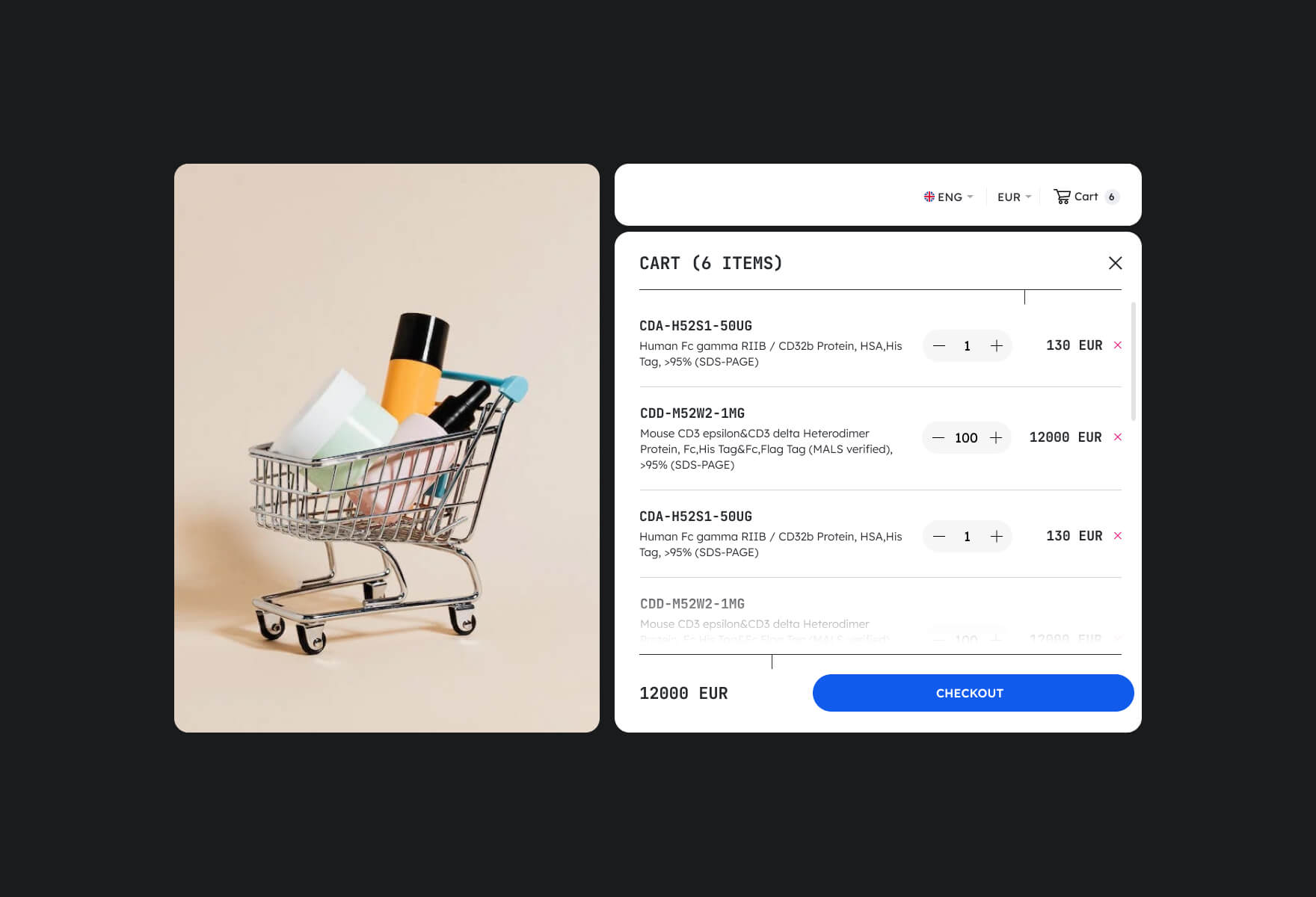
The shopping cart is a great example of using a mental model in e-commerce. To help users organise their intended purchases it provides a friendly way to structure the checkout processes, and allows them to easily add, remove and review their items in cart. Online store shopping cart works in a similar way with the physical shopping basket, where users selecting products they want to buy and put them to the trolley.
The cart icon usually appears in the top right corner of the website, and usually it looks similar to what you can see in supermarkets or any physical store. It shows the number of items in the cart, making it easy for users to keep track of what they’ve selected. However, it assumes that users are familiar with the physical concept of shopping.
Burger Menu

Burger menu is a three-lined icon that typically appears in the top right corner of the screen and expands into a full sized menu when clicked. It is a useful way for designers, as it allows them to clean up the interface and provide a better user experience.
While on mobile versions of websites a burger menu is a natural way of hiding a full size menu, designers must consider the context and user needs before deciding to use a burger menu on a desktop. Sometimes essential navigation options should always be easily accessible.
In most of the cases you can see the burger menu in only one way – three lines, and you natively understand that you can click and get access to all items in the navigation.
Forms

Using forms is a way to submit information to a website or business and can collect specific data such as names, email addresses, messages, etc. For example, contact forms are often used as a primary means of communication between a business and its customers, design and implementation of those forms can significantly impact user experience. Poorly designed contact form can lead to confusion and frustration and optimise form – designers must consider factors such as hierarchy, labelling, validation, and error messages, ensuring that the form is easy to complete and understand.
Phone number with chunking

Chunking is the formatting of phone numbers, where a long string of digits (often more than seven) would be difficult to process and remember. By chunking the digits, and formatting them in a way that is easy to read, a phone number becomes much easier to memorise or process. You can always recognize the format for the country code, area code, and main number in a moment.
Designers always must consider how to display phone numbers in a way that is clear, easy to read, and consistent with user expectations and never use all the seven numbers in a row.
Hierarchy in text

Hierarchy in text is a mental model that is standard used by designers. It is created to organise and structure information in a way that is easy to read and understand. For example in the blog – hierarchy is created by the use of different sizes and styles of type to indicate the relative importance of different elements in a piece of content – a headline may be set in a larger font size and bolded to grab the reader’s attention and establish the main topic, while subheadings and body text may be set in smaller sizes and different colours to indicate supporting information.
It is an important consideration for designers because it helps guide the reader’s eye and create a visual hierarchy that makes it easier to scan and absorb information. It is very bad to read text that contains only body fonts.
Search Fields
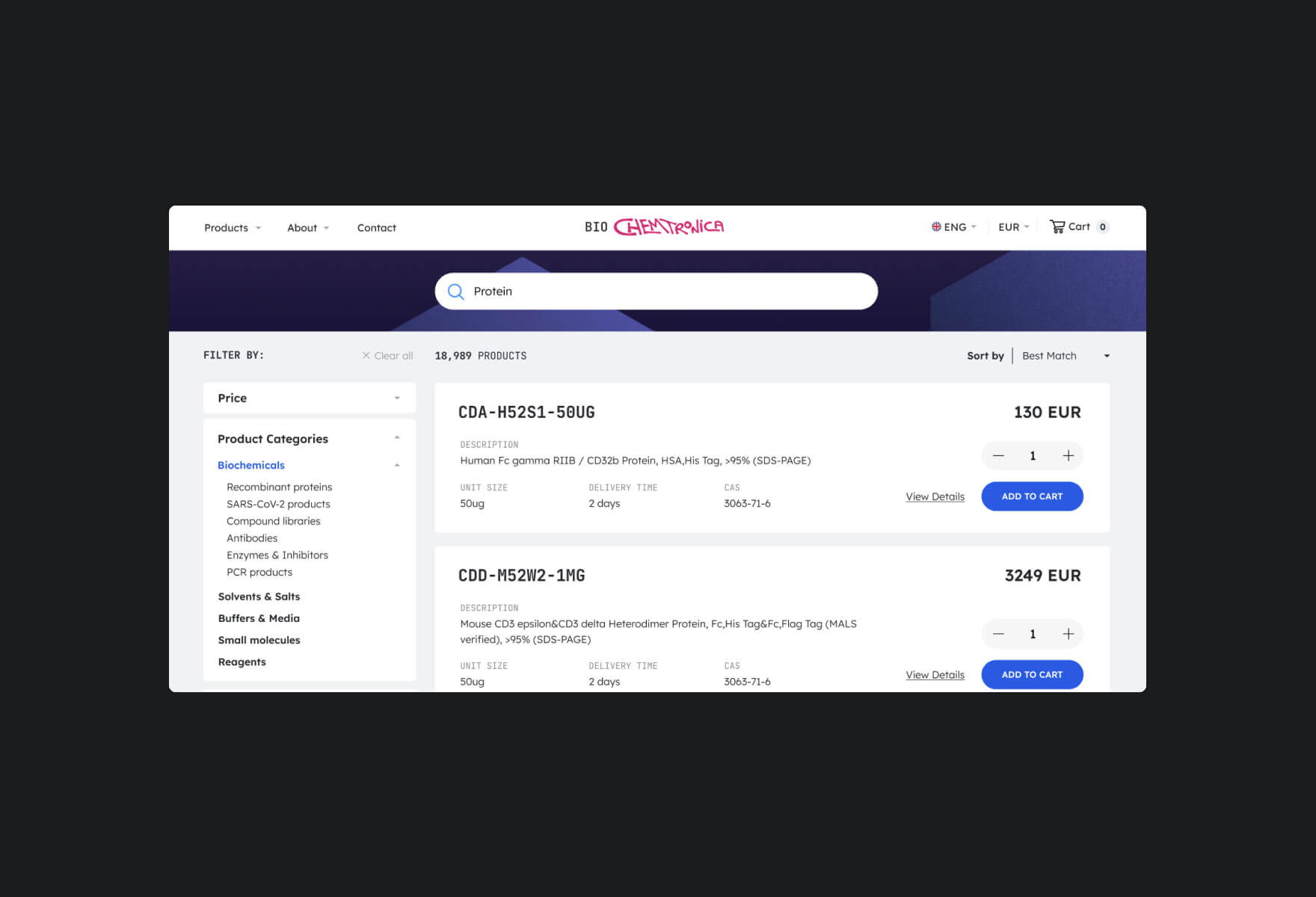
Search fields is alway using a similar way of design, placement and icon (loop), and can be customised to search for specific types of content such as products, articles or anything else by providing users with a familiar way to search for information on a website.
Designers may incorporate filters and sorting options to enhance the search experience and improve usability, that helps users quickly and easily find the information they are looking for on a website with a hundred items.
Pricing Tables
Pricing tables are often designed with a similar layout and structure where users expect to see similar patterns, such as a list of features or services included in each plan. Also, they are looking for clear pricing information and the ability to easily compare plans side-by-side.
By following these established conventions, designers can create a pricing table that is easy for users to understand, navigate and conversion oriented.
Designers need to ensure that usability is not put in the back of originality.
For designers working with websites, interfaces, and ecommerce projects – understanding the mental models of users is essential and to accomplish this, designers use various methods such as building journey maps and empathy maps to reach the goal – gain a deeper insight into users’ objectives by using existing mental models to design a product or experience that is in line with their established understanding.
Innovation is never appropriate, but creative thinkers must evaluate the best approach by considering user needs, context, and any technical constraints before creating something new.