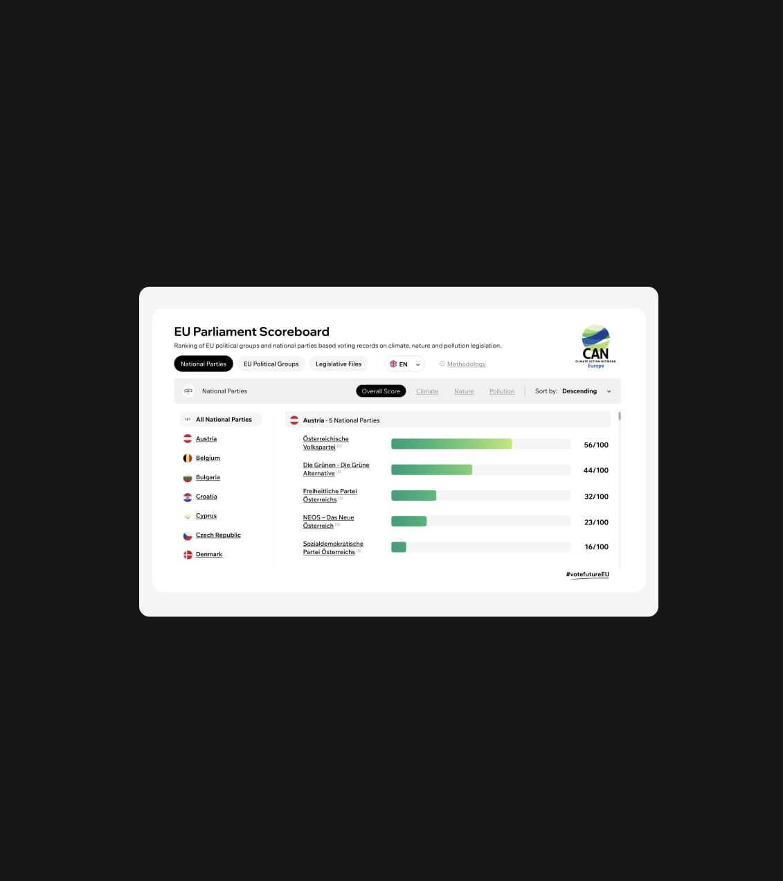
UX/UI Design Trends For 2023
We’re including both UX and UI trends in this list, as both are equally important in creating an effective site. But before we jump into the various ways interface design is evolving, let’s briefly talk about why it’s essential to stay on-trend with site design. Keeping on top of these trends can often feel like a pretty enormous task, so we’ve taken it upon ourselves to share just some of the newer design trends emerging in 2023.
The Importance of Good UX/UI Design
Online, your website is the face of your company. Fewer and fewer people are visiting stores in person, favoring instead to simply search for your business on the internet and get their answers from your site. It’s imperative to your success that when customers search for you, what they find is pleasing and efficient.
This not only pertains to how your site looks, but also how it functions. Is it easy to use? Does it retain their attention? Does it provide them with what they’re looking for? Does it portray your service in the best light? You need to ask yourself all of these questions before going live with a site design.
Any web designer understands that good user inteface design and user experience can make the difference between a sale and a visitor simply bouncing off to another site. We’ve selected the following four trends emerging in 2023 that are sure to pique any customer’s interest, and ensure that you aren’t underselling your services with a poorly designed user experience.
Animated Illustrations
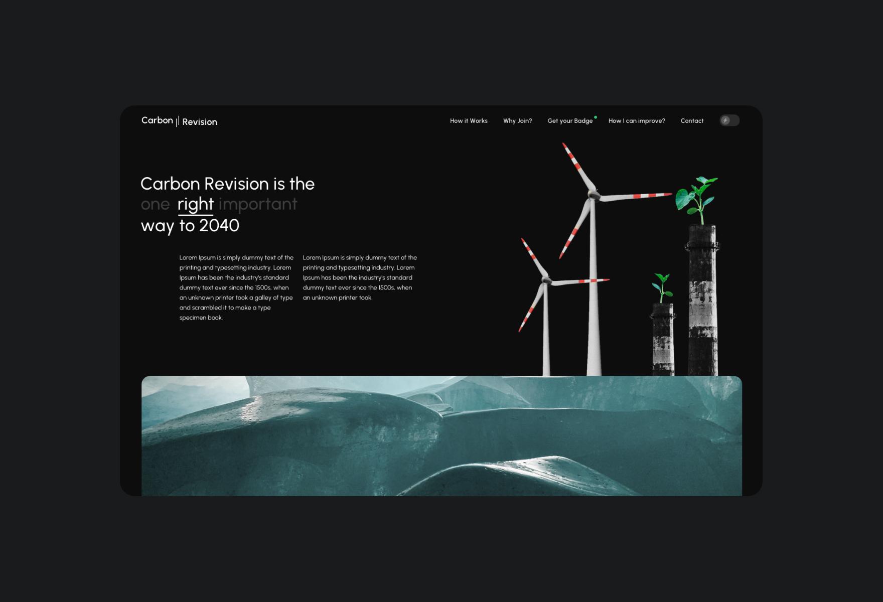
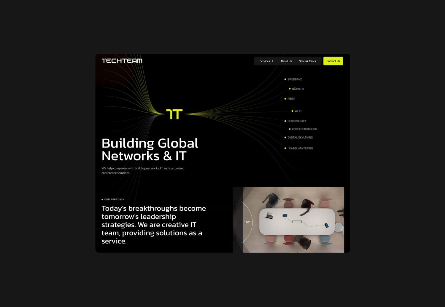
A little animation can go a long way, and site designers are waking up to this. Granted, animation has been used in interface design for years now, but it isn’t the animations themselves that are seeing a revival in 2023. Instead, it’s the way that they’re implemented.
Animated illustrations are often very subtle, as no site user wants a thousand things leaping out at them when they’re just trying to gather some information, but they provide a unique level to site design that can prove invaluable. Simple animated illustrations can make a site feel cleaner and more organized, especially if they’re used when a visitor is moving between pages.
They’re also a fantastic way to grab a user’s attention. If your cursor hovers over a particular section and an animation starts up, it encourages you to click through. It also breaks up some of the heavier portions of your site, which is a must given how short the average attention span is in 2022.
Estimated Read Time

Speaking of limited attention spans, let’s talk about estimated read times. Sometimes lengthy text is unavoidable. Your service requires adequate explanation, and your customers deserve to have all the information available to them before committing to any purchase or subscription.
However, any site designer knows that in 2023, people are not prepared to read pages of text. The snappy nature of social media has made it so that if it isn’t bite-sized, people won’t engage. This makes sharing information difficult, but by adding the estimated read time above a chunk of text, you let people know what they’re getting into.
The majority of people (perhaps you included), when faced with a long read, will scroll to the bottom to get some idea of how long it’s going to take them. If it’s too long, they’ll just leave for another site. By installing an estimated read time module at the top, it encourages readers to stick around by essentially saying ‘this looks like a lot to read, but it really won’t take long’. This is a great example of a simple design alteration that can make a big difference, without compromising on information quality.
Asymmetrical Interface

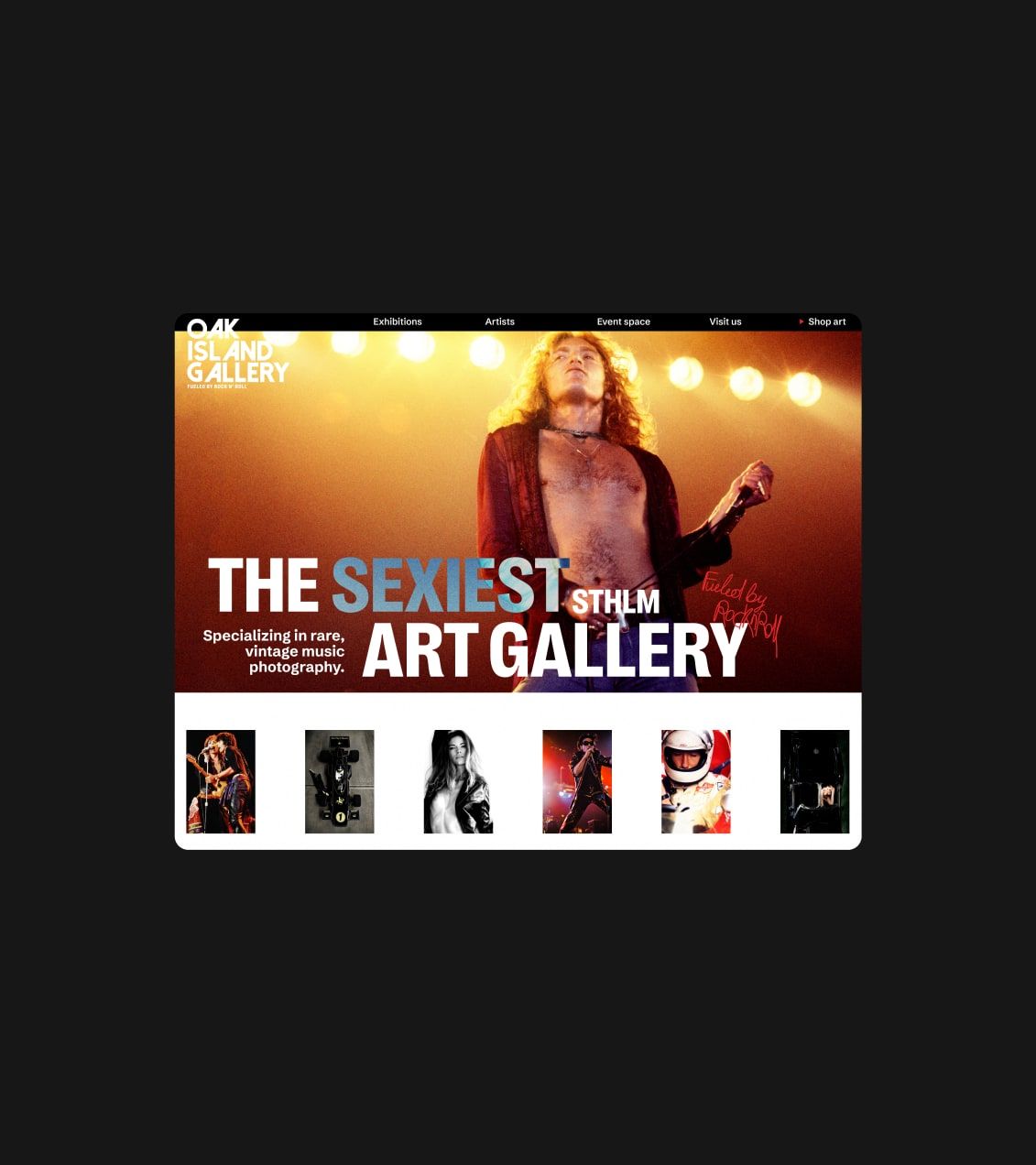
Perfect symmetry is no longer in style. While a perfectly neat interface may seem appealing on paper, as time goes on and demands to create eye-catching sites increase, more and more designers are implementing asymmetrical styles with some pretty satisfying results.
It might sound initially messy, but asymmetrical designs actually provide a huge amount of character to a site that could otherwise look a little plain. Moving into 2023 we expect to see more and more websites utilizing this design quirk, just make sure your user interface doesn’t sacrifice ease-of-use in the pursuit of aesthetics.
A truly successful website needs to make the most of both practicality and visual appeal. Asymmetrical design can add a lot of dynamic personality to your site, but just make sure you don’t implement it to the point that it’s confusing to navigate. Balance is everything.
Empty Space
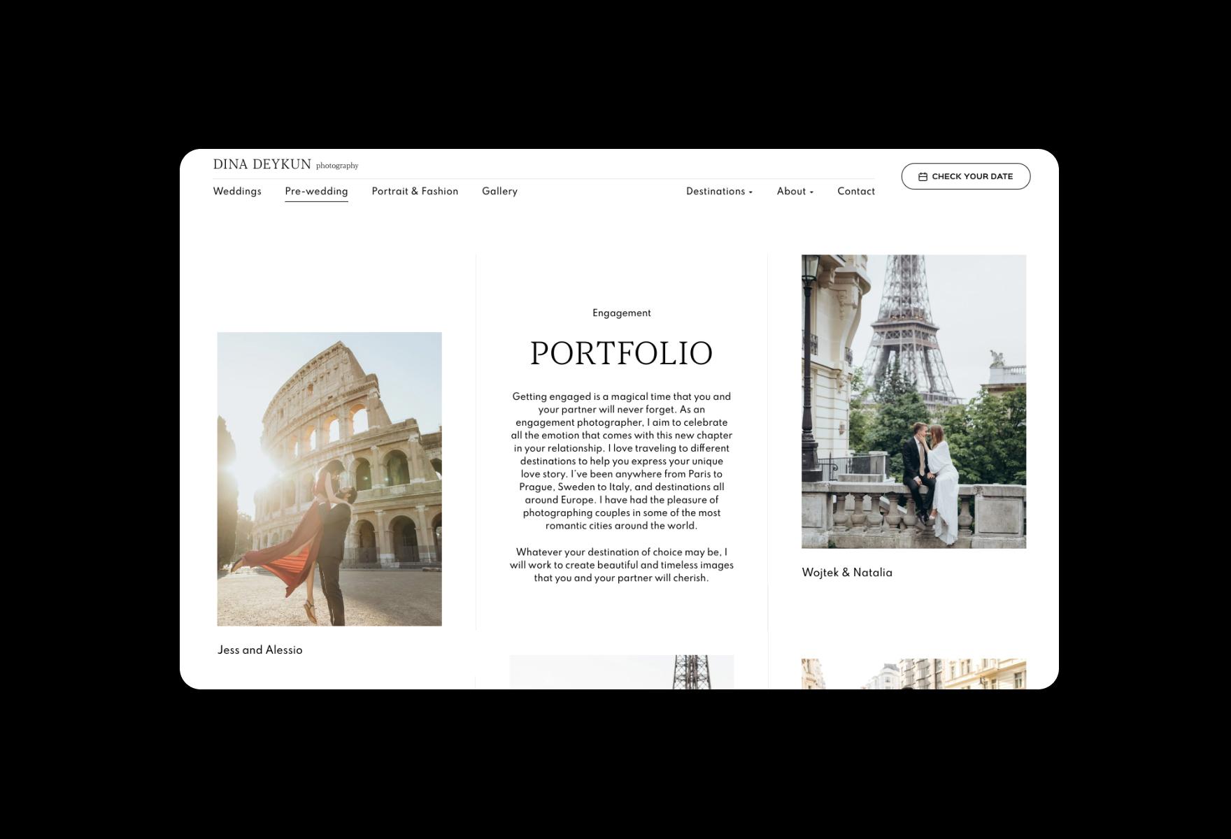
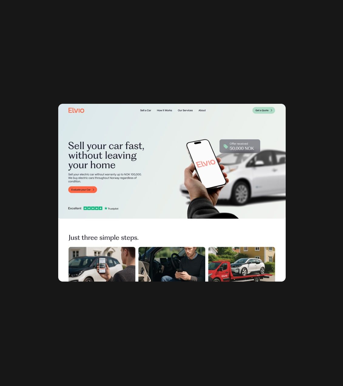
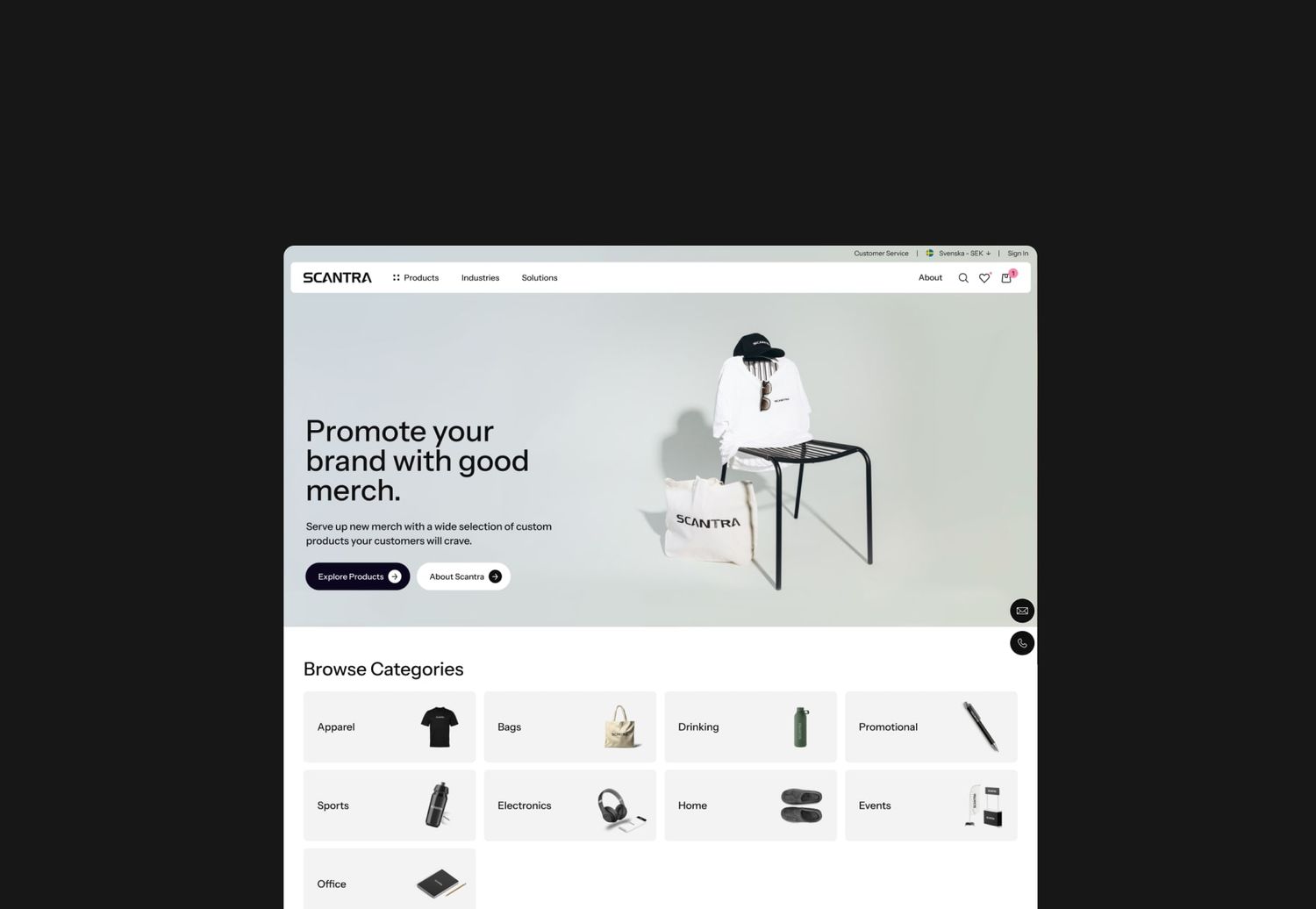
Sometimes, less is more, and that rule has held its place in the world of design for decades. It’s also true for digital design. We already stated that no visitor to your site wants to be bombarded by media. They want answers to their questions and solutions to their problems in a way that is easy to digest but also visually appealing. Expert use of empty space (sometimes called white space) provides just that.
It can be tempting to load your site with all of the newest trends, but all this does is lower the effectiveness of all of them. The careful implementation allows for your site to excel in specific areas. Instead of having a home page with six trends wedged into the interface, consider using empty space to draw attention to the information most relevant to that page.
The modern attention span leaves a lot to be desired, and that’s exactly what makes empty space such an effective design tool. When information is filtered in this way, your visitors can process it much more easily, making for a streamlined user experience.
There are several trends floating around in the world of site design, so finding the right ones for you can be challenging. The key to selecting which trends to implement in your design is understanding how well they sync with your business style and how that’s going to read to customers. You want your site to be fully representative of your company, so your UX/UI should reflect this.
Article updated: 29 March 2023

